
You can’t beat a good line.
One thing I’ve grown to appreciate more and more these last, lo, 40+ years of my comic book obsessions, is the elegance of a good line of artwork.
I’ve watched comics go through phases from the powerful dynamism of John Byrne or Neal Adams to the over-etched details of the Image Comics house style to today’s computer-augmented slick comics art style. Some I like, some I don’t. (I can rarely pick up a Marvel Comic from the mid-1990s without an involuntary shudder at the sub-Liefeldian scratchiness of it all.)

But a good line – well, that’s timeless.
In my own feeble comic book scribblings it’s taken me a long time to learn that less can mean more – like many, back in the 1990s I quickly became enamoured of the Image comics “lots and lots of lines” school of art for a while there, and while I love the artists who can do amazing intricate detail – I’m thinking of Barry Windsor-Smith here, or the remarkable Gerhard’s impossibly grandiose cross-hatched background work on Dave Sim’s Cerebus – I also can now see the beauty in a single few flowing and infinite lines.
It took me a while to realise you don’t need to fill every millimetre of a panel with artwork.

I favour a little minimalism now, whether it’s old or new – the retro cool of Darwyn Cooke, the masterful hand of Will Eisner, Jeff Smith’s dynamic humour in Bone, the cool and elegant indie hipness of Daniel Clowes or Adrian Tomine, the chunky power of Harvey Kurtzman war comics, Frank Miller’s noir slashing brutalism in Sin City (before his artwork got too abstract for its own good), the gorgeous lines swished together with a lot of chiaroscuro shadows in Sean Phillips’ latest excellent crime thriller joint with Ed Brubaker, The Knives.
There’s something to be said in just considering the lines in artwork, the way a skilled artist can fluidly widen or shrink his line with a dash of the brush, or sketch out a world of emotion in a few quick strokes. I like to sometimes just marvel at the arc and curve of a good line, and the talent involved in making it bend just so.


And oddly, perhaps in my kind of second (or third) childhood, I’ve become a big fan of “kiddie comics” the last few years and seeing with a new eye the astounding talent that you find in Carl Barks, John Stanley’s Little Lulu, Al Wiseman‘s Dennis the Menace, even Hot Stuff and Richie Rich.
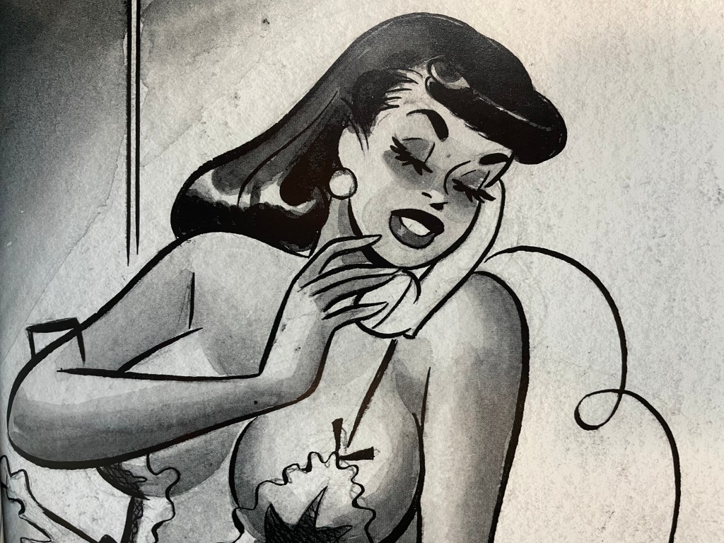
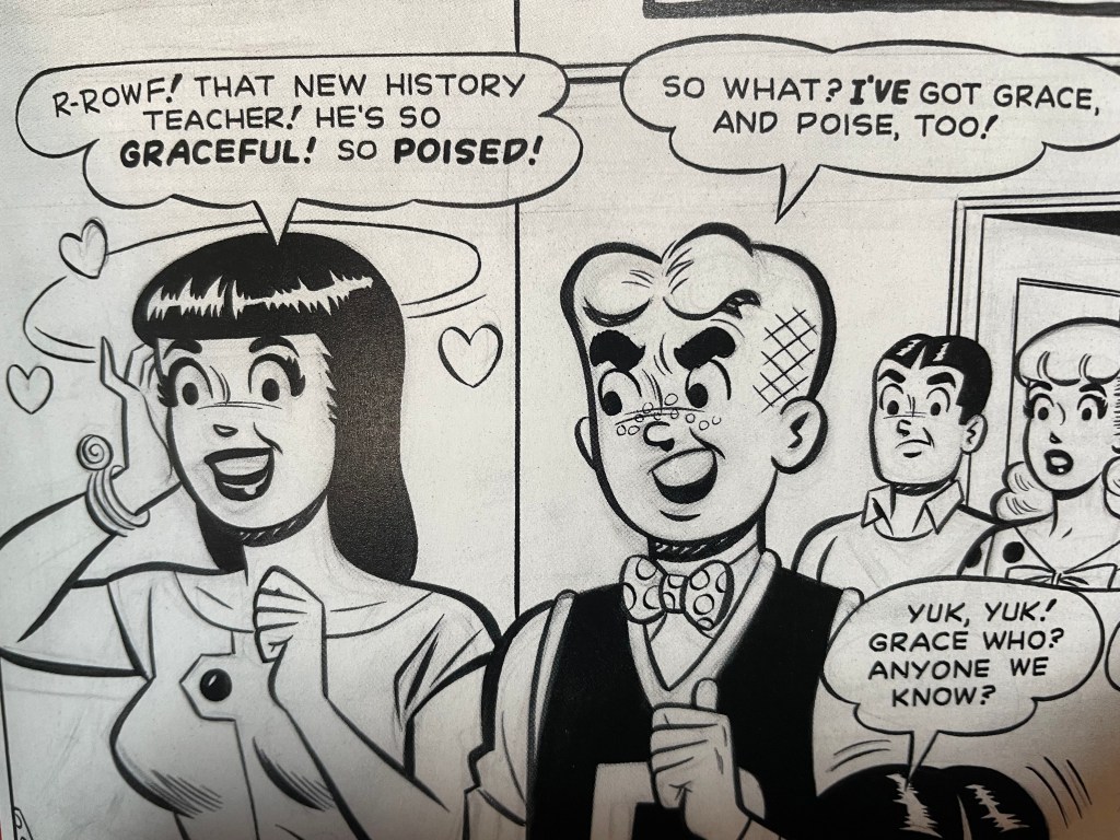
And heck, Archie comics, which have always been looked down a bit by comics snobs, have some of the crispest linework and designs in the business, especially when they were drafted by dazzling Dan DeCarlo. I grabbed a handsome art book of his Archie and other work recently and can pore over it endlessly, admiring all those beautiful, beautiful lines. There’s so much a brush can do, eh?


Comic art can take a million different forms and that’s cool – I can still handle a Jim Lee Batman drawing with all those fiddly little lines delineated for every muscle in Bruce Wayne’s face, but sometimes, you just want to soak up a good, bold line.

The late, great Mike Parobeck, who passed away in 1996 at the much too young age of 30, was another master of the “less is more” style of artwork.
LikeLike