First, a disclaimer: Neal Adams is one of the all-time great comic book artists, and a favourite of mine ever since I picked up some tattered ‘70s Batman reprints and discovered that dynamic, bold style that truly changed comic art.
Adams exploded on the scene with his Batman and other work in the late ‘60s and was a loud revolutionary – he broke comics out of their staid grids and made the comics camera move, and gave Batman, Deadman, Green Arrow, Superman and many more a radically realistic upgrade. His characters heaved with emotion and muscle. Adams, who died in 2022, was truly a trailblazer for comics.
But man, I wish he could have stopped tinkering with his comics.
Adams was notorious for recolouring, relettering and even redrawing entirely his vintage ’60s and ’70s work when it was reprinted in fancy collections in later years. It almost never improved the art. It often made it a lot worse.
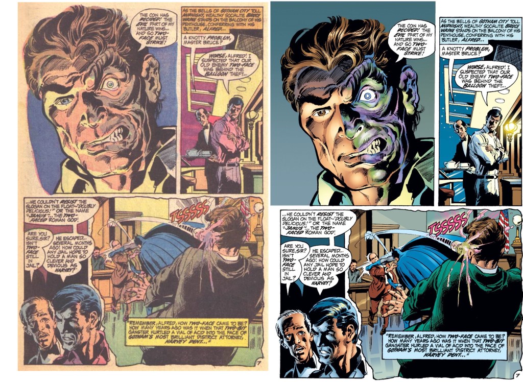
It was highly noticeable in a Deadman collection I was just re-reading, where Adams’ art is tarted up in garish colours that instantly look dated, re-lettered with bland computer lettering and woozy airbrushed looking highlights and backgrounds. The one on the left is the original. The one on the right in Deadman Book One is almost an entirely redrawn and reworked page.

A few pages later in this same collection, other Adams stories of the era are reprinted as they were – the same dynamic art is given a calmer, more fitting look with the original colours. The styles – old-school Adams and tinkering Adams – clash mercilessly when jammed together into one book.
Even worse, in collections of his utterly iconic Batman comics of the era, too often they’re served up with gaudy new colors, hideous gradient backgrounds and art tweaking. Give me yellowing newsprint and the work that came from the pen at the time any day.
Does it look more “modern” when Adams reworked colours and art? Sure, I suppose. But the point of old things is that they are old, and not intrinsically worse because of how they were done at the time.
I’m a developing cranky curmudgeon, I know, but the flatter colouring of vintage comics was just right for the time, and recolouring old comics in modern styles feels to me just as much of a creative violation as colorising old black and white movies is.
This has all been quietly infuriating Adams fans for years, and it raises lots of hard to answer questions about fans, creators, and who has the agency.
Like Adams, I believe in creators’ rights, and it’s a knotty question that if Adams wanted to “update” his work like George Lucas has bowlderised the 1977 Star Wars, isn’t that his right? I’m still working that one out. But I believe the work should be reprinted faithfully to how it was first produced. If you want to make a new “updated” version, too, knock yourself out, but don’t suppress the original.
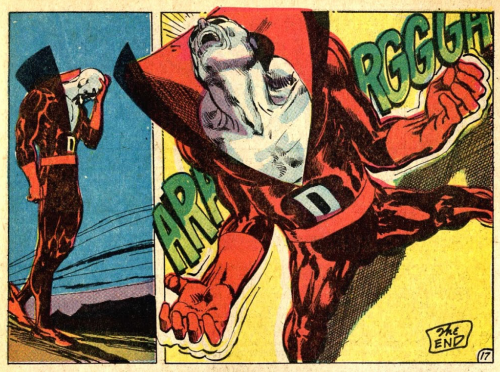
Adams kept working all the way up to his death at age 80, although few fans would say later work like Batman: Odyssey and Fantastic Four: Antithesis lived up to the classics. Adams’ art also took a turn for the grotesque in his final years – all the dynamicism of his early work ‘roided up somehow to look more than a little weird. And let’s not talk about his writing, which was never his strong point:

All artists change their style as they go and so hey, Adams changed, that’s cool. But going back and reworking the work that put him on the map and making it difficult to even find the originally coloured and drawn versions in modern reprintings — well, I love Neal Adams, but I do wish sometimes he would have stopped tinkering and just appreciate his accomplishments as they stood.
He truly was one of the greats – and he was from the moment he first exploded onto the comics scene more than half a century ago.
